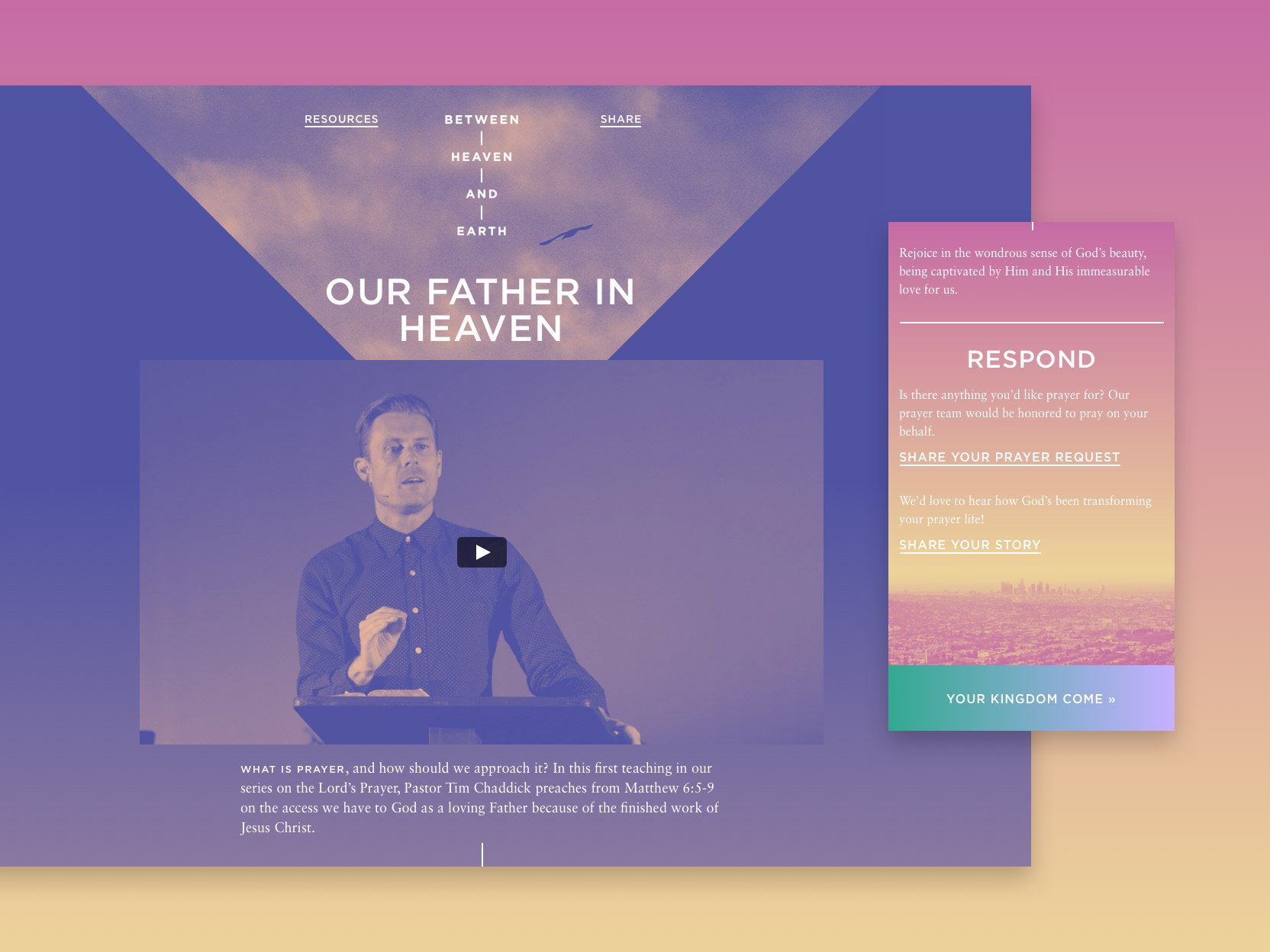
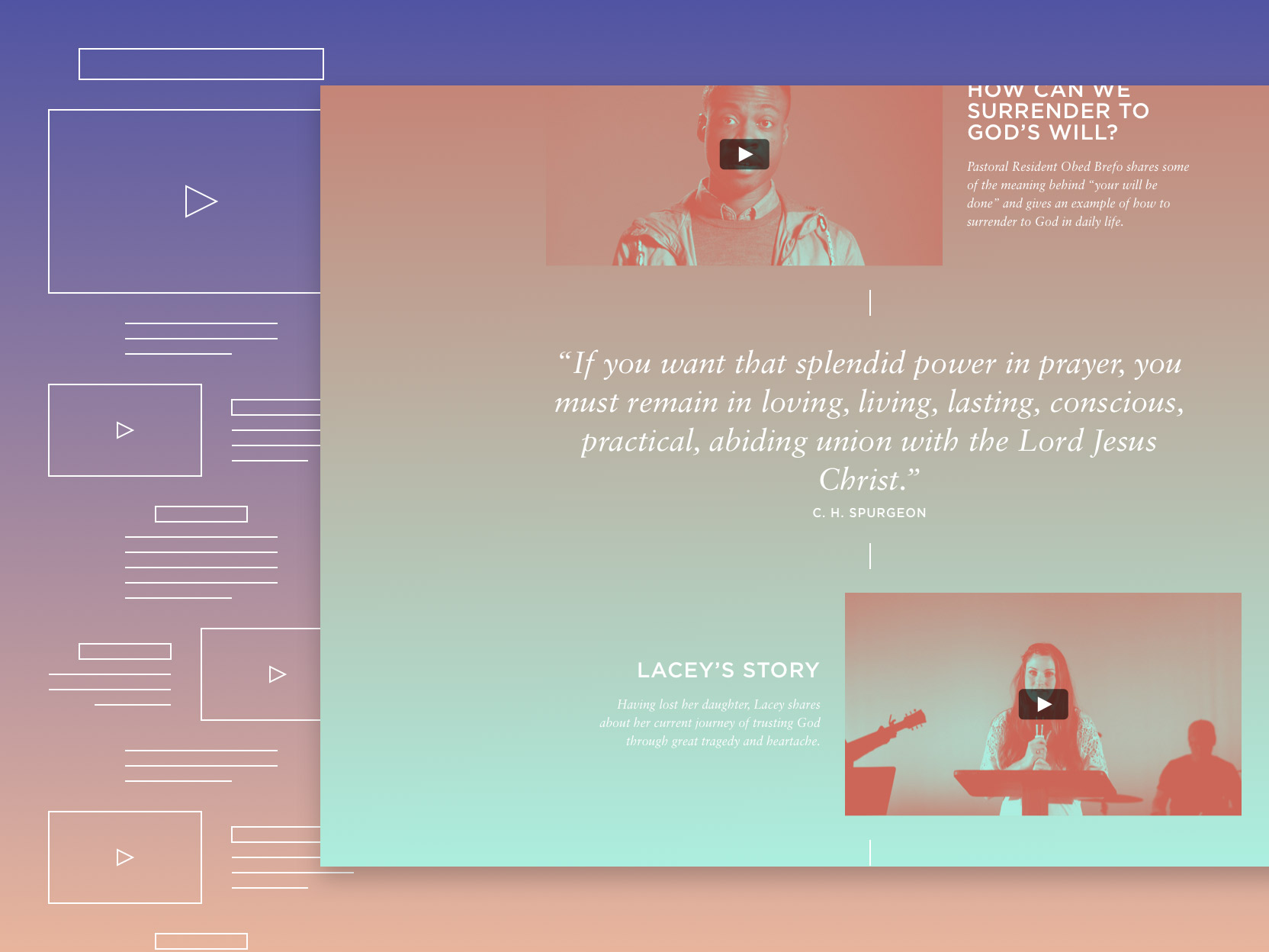
The Lord’s Prayer is one of the most well-known excerpts from the Bible. Chances are that you know parts of it even if you don’t know where they came from. That familiarity, though, can work against meaning. Between Heaven and Earth aimed to draw out depth and instill meaning back into these well-worn words. I developed a unified brand and step-by-step website to accompany the series.
Between Heaven and Earth

Branding transcendence.
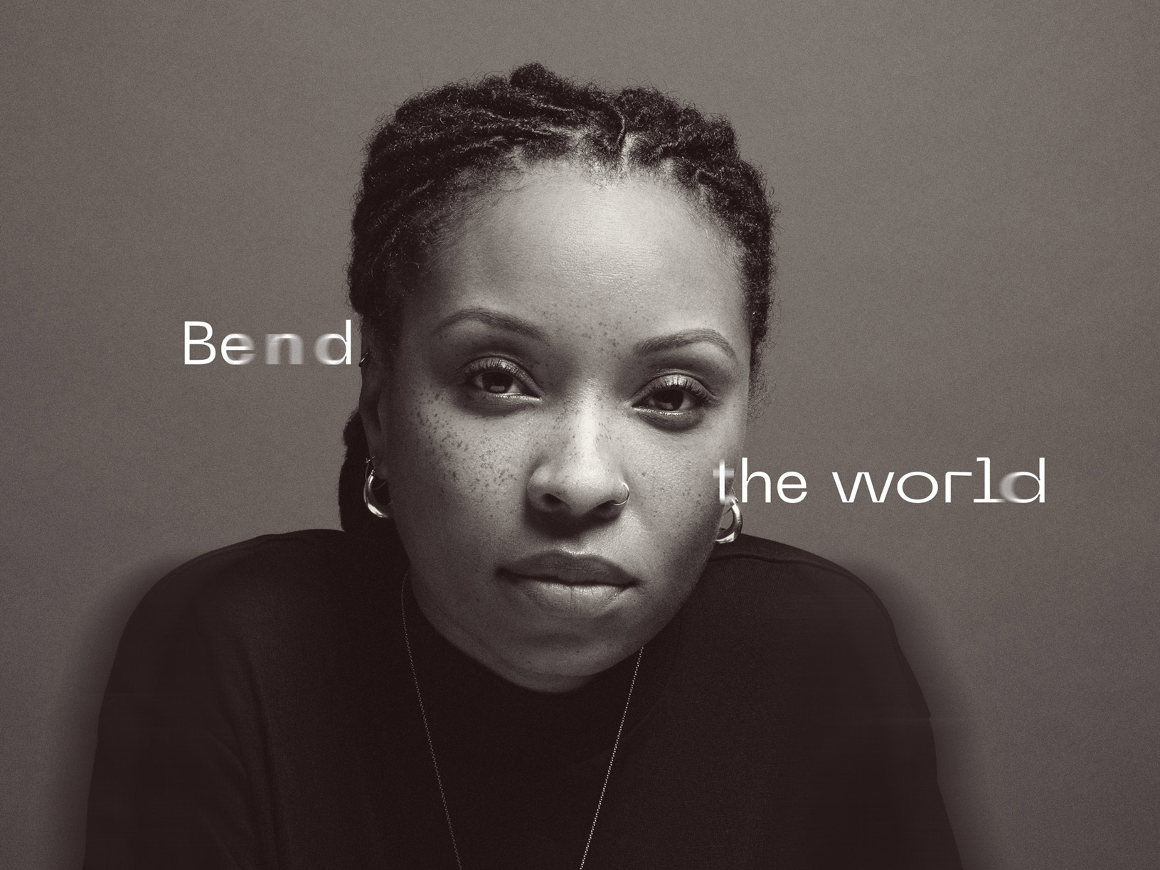
The main branding focused on the concept that prayer transcends the boundaries between heaven and earth. The Lord’s Prayer has wide-ranging themes, but the visual branding keeps that main idea present.


Developing for now and later.
One of the driving constraints in the design phase was the tension between the dual purposes of the site. Our primary audience was a few thousand people following along over a single 8-week period. Once the series was over, however, visitors to the site would have different needs. I developed a flexible site that gradually adapted from dynamic blog to static resource.


Venice
